Wix
Context
The Lincoln Chronicle is the student publication of Lincoln University in Oakland, published since 2018. I became Editor-in-Chief on 15 October 2026, and redesigning its website was my first project. I did the design, content strategy, build and launch myself in Wix, and the new site went live on 22 October 2026. It is the third design the site has had and the first one I made.
The problem
The old site looked like a template, and readers had no clear way to find stories by topic.
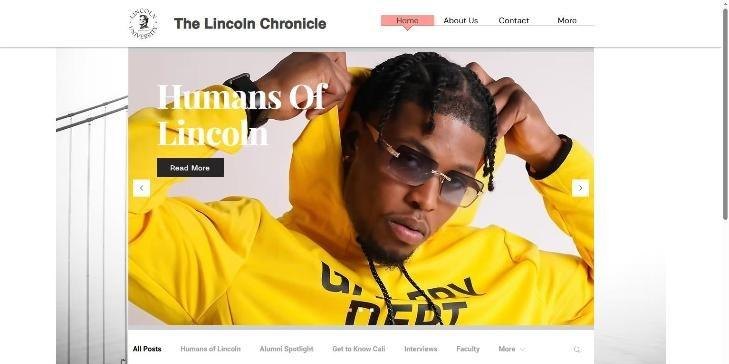
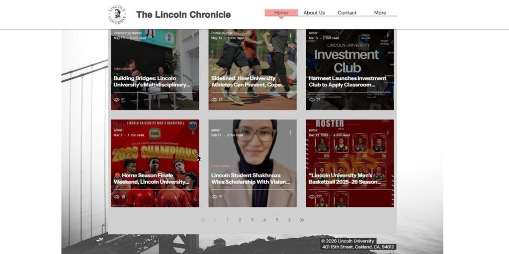
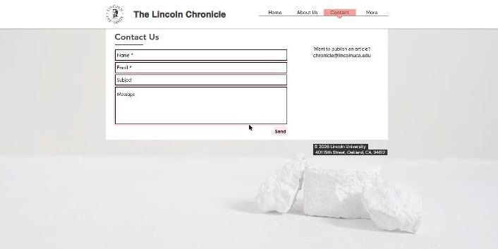
- Nothing used Lincoln's maroon and gold. A grey Golden Gate photo sat behind every page and the menu highlight was salmon pink.
- Headlines were hard to read. Stories sat in dark photo tiles with white text over busy images.
- Eleven categories overlapped, such as Interviews, Humans of Lincoln, Alumni Spotlight and Faculty, and most stories were hidden behind a More menu.
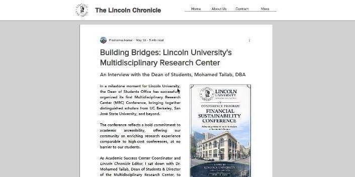
- The 130 articles used different fonts, justified text and mixed image sizes, with no shared layout.
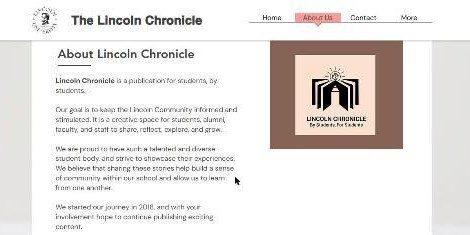
- The About page still had the old peach logo, a plain text list of past staff and out-of-date team names.
What I did
I worked directly in the Wix editor, Wix Blog, the CMS collections and Velo page code.
- Before changing anything, I logged every page and all 130 posts in a shared project sheet, with the problems in each.
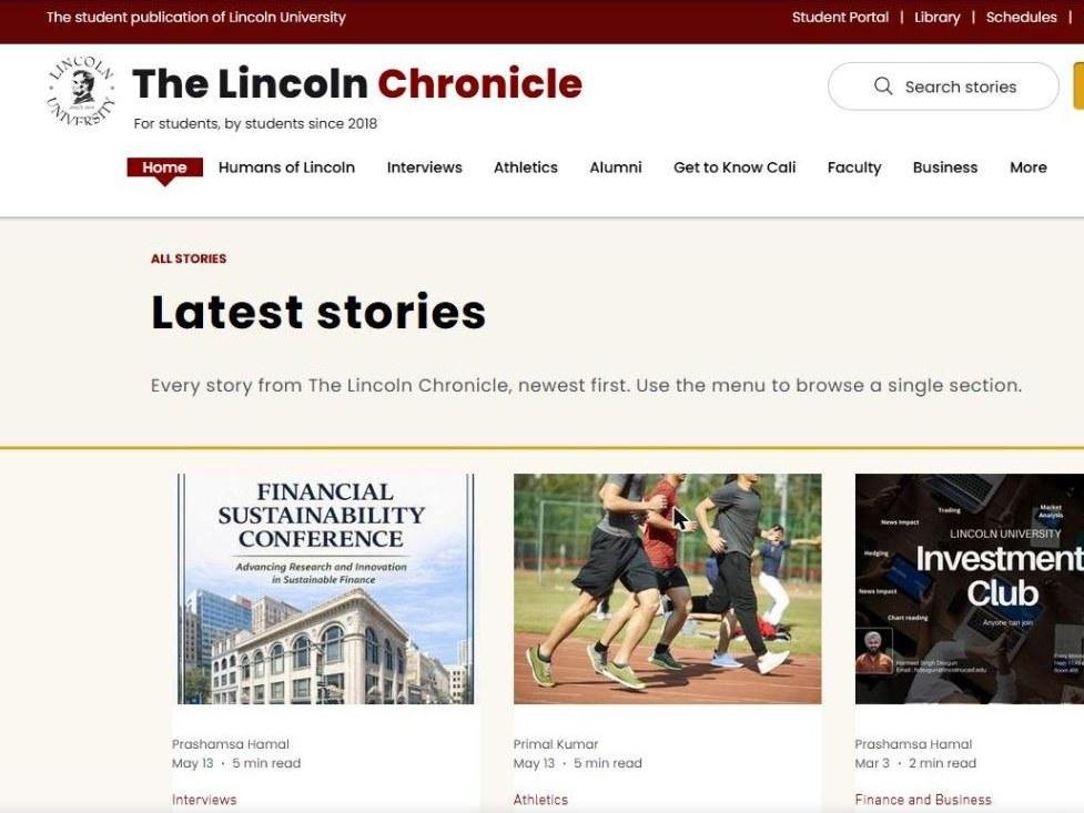
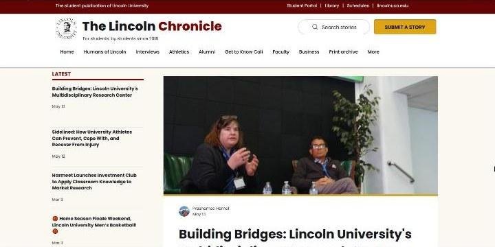
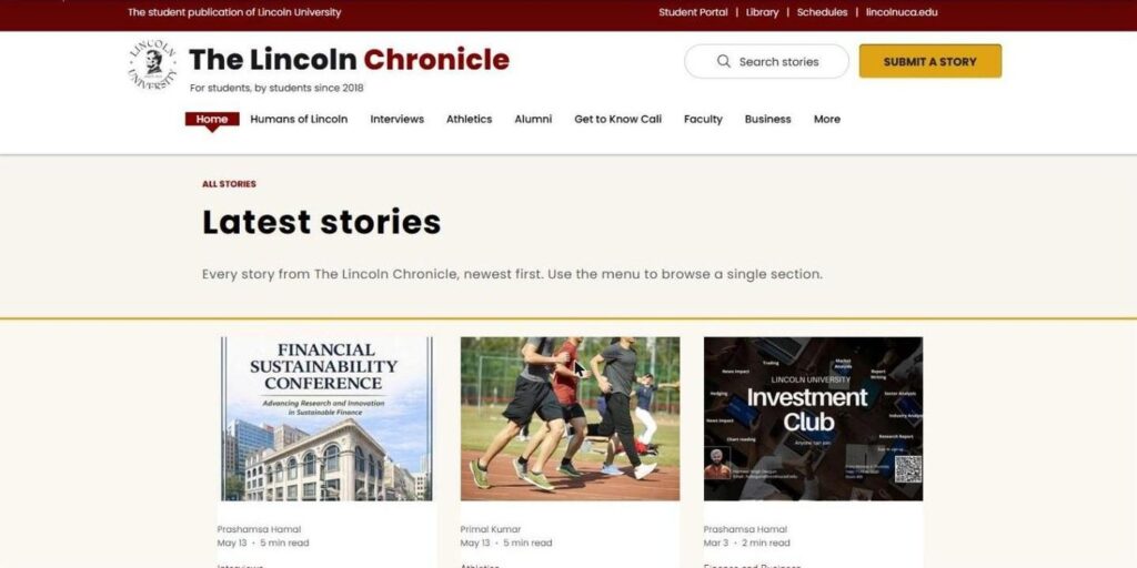
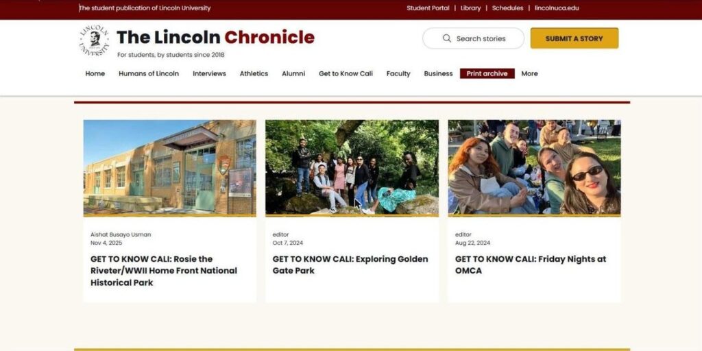
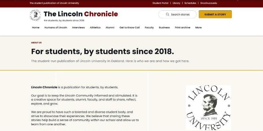
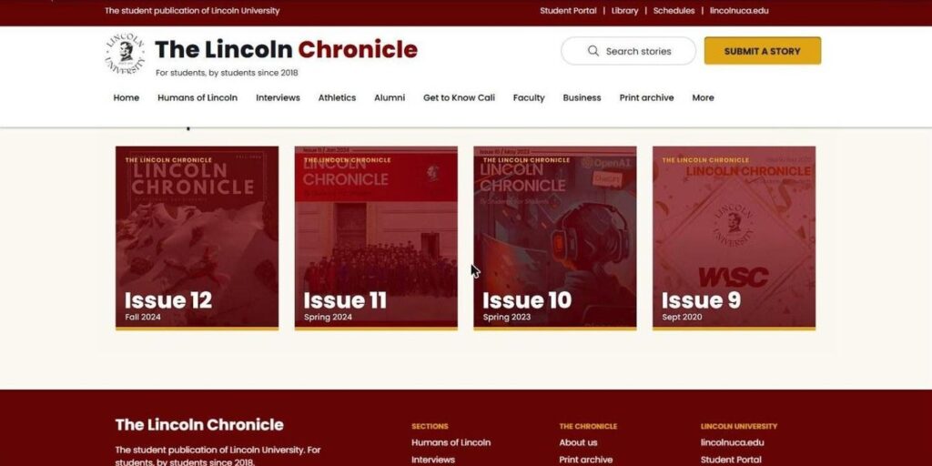
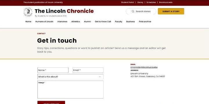
- I built the look on the university's colours: maroon (#800000), gold (#DFA414) and an off-white page, with Poppins for all text. The same details repeat on every page: a gold strip under photos, a 3px maroon rule under section headings, a cream title band closed by a gold rule, and a maroon band for calls to action.
- The header has a maroon bar with links to the Student Portal, Library, Schedules and lincolnuca.edu, then the two-tone masthead, search and a gold Submit a story button. The footer is maroon with three columns.
- On the homepage I replaced the photo slider with a Latest list beside a lead story, then one row per section, each with a More link.
- I restyled all 130 articles in batches to one template: section tag, byline, bold headline, dek, left-aligned 18px body text and consistent images.
- I regrouped the 11 overlapping categories into 7 sections: People, Campus Life, Athletics, Voices, Student Guides, Business + Health and Beyond Campus, plus the Print archive. I moved every post into its new section and updated the menu, footer and homepage rows.
- I rebuilt the About page on a CMS collection of the team, so Current team and Our history update from data instead of hand-edited text.
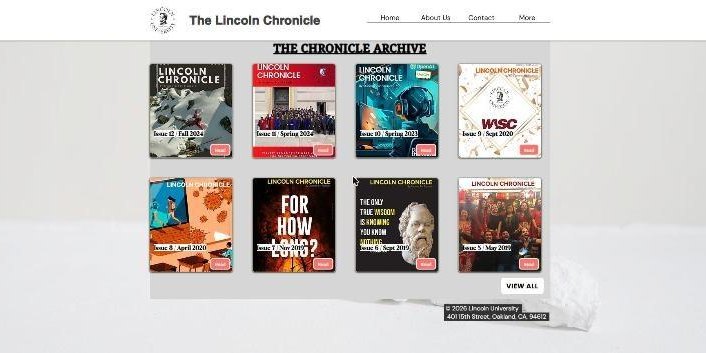
- I redesigned the Print archive and Contact pages, and added a topic dropdown to the contact form.
- I reviewed every post and flagged 32 as outdated, duplicated or needing an update, each with a reason, for the editorial team to decide on.
- I listed 28 writers, marked who still needs a profile photo, and drafted an outreach email to them.
- I wrote brand guidelines, set the slogan "By students, for students." and narrowed new logo designs to two finalists. This part is still in progress.
How I used AI in the audit
I used a generative AI tool only for the audit of the 130 articles. I asked it to go through the archive, flag posts that looked outdated, duplicated or in need of an update, and suggest how the 11 overlapping categories could be grouped.
I checked everything it gave me by hand, against the posts themselves. Where it got a post or a grouping wrong, I corrected it before anything on the site changed.
Before and after
The after screenshots were taken during the build, so the menu in them still shows the old category names. The live site uses the seven new sections.
Homepage
Story feed
Article page
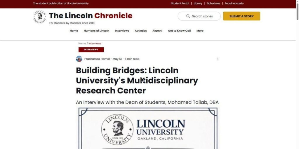
Section page
About page
Print archive
Contact
What shipped
The new site went live on 22 October 2026 with every page and all 130 articles on the new design. The figures below come from my project audit sheet.